Wednesday, April 9, 2014

Final Stretch

The last two weeks have been jam packed with excitement, stress, and production work.


Teeny flipbook


All of the characters are finished, with rigs and finalized textures now. And I even did my first bit of vfx work with a particle system for the enemy bot. It's simple, but I'm proud of my first step in that direction. 


I think what I learned most from this project was about animation and rigging. I've never needed to make rigs for things like this, so it was good for 1. helping me brush up on the things I do know and 2. push me to learn more about rigging. It was useful in that last sense because once I knew what I wanted the character to do, it was easier to try to translate that into 'how can I make the rig do that' or 'how can I arrange the rig so it's easy to use and not too muddled'. There are a few extra features I would have liked to add onto a few of the rigs. Squash and stretch was something I looked into, but wasn't able to really get the rig to work for it in a way that fit the characters. I want to try making a squash and stretch rig for that at some point.

Senior Show is next week on the 17th! I'm nervous, but excited. Everything's coming together for the end of senior year. Now there's just those papers to catch up on... I should probably go do that.

Thanks for watching! I'll probably end up continuing to use this blog to catalog  progress on my next art pieces or other game projects. We'll see.


Sunday, March 9, 2014

Playerbot Rigging blues

Hello!

Here's a bit of an update.

After a lot of thinking, planning, and experimenting, I think I have the basic idea of what player-bot's rig is gonna look like. Making custom rigs is totally new to me and I spent a lot of time looking up tutorials. It's been interesting expanding upon the bit I knew previous about rigs and its starting to make a lot more sense now.


The main objects that are gonna be animated are his arms, wheel, visor, and himself (get the body to balance on the wheel/the wheel to be able to move forward a bit independent of the body).
I'm gonna see if I can schedule a meeting with our animation teacher here to get some advice/help with the rig.


Enemy bot's finished model with color

Made some new concepts for helperbot as well! Last time we looked over playerbot as a team we weren't really sure what to do with him so we let him be to work on the player and enemy bot. 


Having those two done already makes it a little easier to see what kind of designs will fit in and make the trio more cohesive together. Helperbot needs to have a more horizontal silhouette because he blocks the player from escaping and acts kind of like a net/barrier. The player is more vertical and is sort of 'standing up', making it vaguely humanoid. And the design of the enemy bot has a lot of small sharp edges with its tiny knife-like feet. It also kind of looks like a seedy little bug. 

Im personally fond of design D. The idea of it idling spinning it's solar panels while it floats makes me smile. 

See you all later this week with more rig updates and a final design for helperbot. 

Saturday, February 22, 2014

Got the texture onto our little playerbot friend. I brought the sunbot into unity and got the texture working on him after a few snags.


Theres a bit of a strange issue when I brought the texture out to a .tga. It made the colors look a little funny and over-exaggerated the watercolor effect I was aiming for. But I think this is a good start for the texture.


We want to try to create the textures for the whole game using actual watercolors, but we'll see how that pans out after this week's testing of it. Next up to consider is how Im going to be setting up the playerbot's rig. I've animated in 3d before, but not in maya, and not really with something that didn't use a bipedal rig. I've been scoping out possible ways to do this, but I think Im going to reach out to some people for help on it since I'm new at the subject.
Let's hope it goes well! See you next week

Friday, February 14, 2014

Character Progress

Hello,

This week I finished off the first pass of low-poly model for the player-bot. It's not texture yet, just put some quick material color on it in Maya to test out a base of how the colors would work together in 3D.


Here's an image of what the model looks like in game, to get a feeling for how much can be seen. Because we're thinking of having the closeness of the camera vary from level to level (depending on how much the player needs to see of the level at once), I feel like this much detail in the model is good.


The enemy character model is on it's way, still trying to figure out how to match the thickness of the model with the thickness of the legs. Need to push the legs a little more so they look more sturdy. The enemy needs the legs to be able to land sturdily on the planets and to collect energy.


Part of this week's work is research into setting up a rig for the main character for animation, which should be interesting; it'll be a learning experience for sure since I've only ever made rigs for bipedal humans and never 'vehicle-like' things.

Friday, February 7, 2014

Main Character


This week, I worked on creating the low poly for the main character in maya. The focus was mostly on making sure the polycount was relatively low (aiming for less than 1500 tris), and making sure everything fit together nicely and worked outside of the concept art.


Some of the comments we got on the art in our project was to make sure our characters had good potential for animation. Because the screen of the game is relatively small on tablet, we won't see the character very up close and their actions are going to help sell the game even better. This weekend Im going to put together a test character for our programmer so she can see if the animation for controller the shooting direction can be done through programming rather than on the art end.  

Friday, January 24, 2014

Narrowing Down Art Choices

After having our class yesterday and doing a review, we've come down to a few design choices for the characters.


Our foremost concern for all of the characters that will be in space is their silhouette. As I mentioned in last week's post, their shape is going to be very important in that it'll allow the players to recognize the characters from afar more easily. This idea is a bit more important concerning the difference between the player character and the enemy characters. 
For this reason we've chosen to go with radical shape differences between the two. As you can see with the Anti-Bot, we want to go for a shape that's much different than the almost humanoid preferences circled in the player-bot section. I want the player-bot to have a lot more softness to it and I kind of like the contrast the anti-bot has at the moment with it's harsh, almost industrial appearance.


Helper-bots silhouette was sort of known from the start. Everyone seems to like it's longer shape which helps in it's function; its meant to keep the players from straying out of the 'playing field' and follows the player around to stop it from doing so. Kind of like a space goalie with the player being the ball. The ones with the red checks next to them seemed to be the more popular during the review in class. I'm particularly fond of the bottom left one and the middle one. 
I've been taking animation into consideration for these, too. Especially for the main character. That was one of the critiques we received for the main character. Now that I'm on as the team's animator, it's going to be an interesting task to make these robots move. The somewhat humanoid one in the top middle of the picture below seems to have the best potential for interesting animations. 


See you next week!


Friday, January 17, 2014

Update 2

Hello everyone!

Pretty straightforward this week, just some concept art to upload.


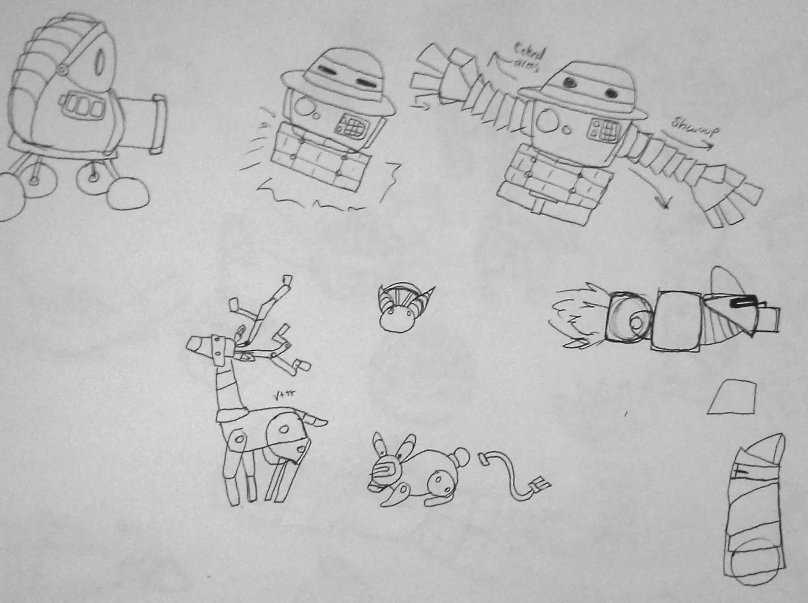
Most of this is just start up to get ready for Greenlight. Our team is planning on doing our greenlight presentation in 2-3 weeks. I'm going to be working on some more character concepts to show the team on Sunday so we can start honing on styles and shapes for the characters. I tried to branch out in the robot's designs. Though there's only one example of it, the reason I didn't want to go into the style of the Mars rover-type robot is that it seems too realistic for this game. But when I showed the concepts to our lead artist, she seemed to like something about it, so that might be something the team brings up as interesting. Otherwise, I tried to push the designs in simple styles, complicated styles, round vs. hard edges, and a few humanoid robots.

We had a discussion about wanting to try out a new mechanic in order to make the zoom in feature more useful. The idea that there might be life on the planets if you zoom in was given, so I started doing some ideas of things that could live on the planets. Robotic animals, anyone? Logically, it might not make too much sense but this game is pretty whimsical so the team might like the idea. 

Till next week!

Friday, January 10, 2014

Start of Second Semester

Hello everyone!

So just to recap, Phantom Mansion did not pass into second semester. The members of our team and the others that got cut were relocated and drafted to other teams. This semester I joined Team SuperGeneric as the character artist for their game, SunBots. In the game, the player control a small robot tasked with collecting energy from planets to shoot into the sun that is dying.

The second semester focuses almost entirely on production. We have the first 3 or so weeks to do some iteration, however, and find new ways to improve our game. As a team we want to explore some different options.

Our first big milestone is Greenlight. The goal for greenlight is to have the final designs of the three in-game characters. These characters in specific are the main sun-collecting robot, the enemy robots, and the neutral helper bot. By next week's update I hope to have concept art for all three characters. For now, I'll post some references I've been collecting for the characters.

The style of the game is storybook-like. The characters created by the team's original artist were intended to be friendly and approachable.


Here are some of the references of other robot character that I think will be useful in achieving a look and feel similar to the one existing.

.
Chibi-Robo and Telly Vision of the game Chibi Robo


main character from Whatever Happened to Robot Jones


Canti from Fooly-Cooly


The robots from Mystery Science Theater 3000


The Iron Giant

Mainly what I want is to create easily recognizable characters. They'll need to have strong silhouettes to stand out against the space backgrounds. I would like to have them be as personable as the first examples but that might not be as much of a issue as the characters are usually seen from far away.

See you next week with the concept art.


Monday, November 11, 2013

Milestone 4

Good morning everyone!

Our team has been up to some serious work lately; we've been busy tightening up in-game mechanics, added art to the prototype, and challenged stage 3 last week and passed! This means we're now in the possible pool for being able to present at mid-year show. We're trying to gather as much together as we can to challenge stage 4 and see if we can get by it.

Our game is a combat platformer where players take on the role of ghosts residing in a mansion who fight each other for sole 'ownership' of the house. Now that you're all refreshed, let's take a look at some screenshots and concept stuff, then.


Here we have some screenshots of what the prototype looks like. The top one is more in-game and the bottom is a more detailed look. This level is mainly what we've been focusing on. The levels of the game are going to be based on specific rooms in the mansion (or small groups of rooms). So for example here, we have the dining room and below it, the wine cellar.
A main goal/thing I want for our environments is to be able to have some modularity in the levels. (This means that I'd like for different items to be usable in different parts of the house without having to alter them  much. So I can use those chairs in other rooms in the house, or that table, or break those stair 'pieces' apart and be able to mix and match them. Think of it like Lego blocks.)


As you can see here, this was one of the main concepts for designing the levels. Other parts of the room are slightly visible, showing the player they can use their phasing mechanic to ghost through the wall and go into the other room. You'll be able to see the framework of the house, mimicking a sort of dollhouse-like feeling.

Here are some concepts for the characters and members of the family in the house. They're colored in this way as that's the way we're going to denote each different player

This is a more concrete example of the stylization we're going to go for in the characters when they're in-game. This example is of the mother ghost.

A big roadblock for our game had been animation and all things entailed with that. I had a lot of issues with setting up the rig and skinning the character, but we got things to a workable place.


There's still some work left to do until senior show, but I think we're getting into a better place. This whole experience has been quite the ride, and we're in it for one more week, mid year presentations take place on Monday the 18th!

Thanks for reading, and stay tuned for this week.

Monday, October 21, 2013

Thoughts on Our Game and Games in General


  These days, it seems like there's so much more possibility in creating games. Thanks for those new possibilities, I think, goes a lot to the burgeoning indie market and different outlets for play besides consoles. Not too long ago, a game, no matter how innovative or interesting wouldn't see the light of day if it wasn't released for console. At the very least, it had a small, very specific audience. While they have their flaws (as consoles have their advantages), applications like Steam, and websites like Kickstarter are allowing for so many more people to have the chance to interact with and learn from video games. It still amazes me that with everything we have now, it'd be possible for so many people to play even our game.

  While we want it to reach as many people as possible, there is still a core audience for our game. We want to reach out to players who enjoy games like Super Smash Brothers and Mario Party. At one spectrum of our audience, there is the more laid-back player who spends most of their time playing games with friends. The only thing really on the line is pride, and even then it's pretty low-key. We're also trying to reach players on the other side of the spectrum. These are the sort of players who took Super smash bros and shaped it into the competitive game it's partly turned into today. Smash bros has a great capacity to reward less skilled players with button mashing but also offers intuitive controls and moves for skilled players looking to improve. There's enough diversity in character play styles to suit everyone and give them something to work towards. Our game is addressing this audience with play that will be familiar enough to draw them in, and mechanics and concept that will be interesting enough to keep them engrossed. From testing our art concept so far, it seems that many people are interested in our idea of being able to play as ghosts in a dark, mansion setting. It's very often that we see ghosts and spectral beings as enemies in games. We thought it would be interesting to try to change that dynamic and mesh it with the secondary mechanics we have in store. This theme is also a challenge as the characters need to balance on the fine line between being relatable to people and being too 'monsterish' and losing their humanizing appeal.

  What separates our game from similar experiences to it is the combination of mechanics we have and are working to include. We have the basics of running, jumping, and shooting projectiles, but this is hardly the full extent of our game. We want our game to go deeper than most combat platformers and have heavy interaction with the environment players are fighting in. We want them to be invested in their environment, and to help with that, be invested in their characters. To do this, we are giving players some choices not usually received in typical fighting games. Players will be able to choose statistics and passives for their character. The character is virtually a blank slate until the player gives it a back story and abilities through our drafting system and choice of passives. While these are normal tenants for other genres, such as RPGs or simulation games, it's still a pretty new system to fighters/combat platformers.


  It is in this way that we hope we can show our innovation and integrity. As it stands, combat games like Smash Bros are pretty well-received. The broad range of couch-gamer to skilled pro seems like a great starting point and a proven audience for this kind of game. Many fighters feature eclectic, sometimes strange locales and characters for their settings and theme, so I'm sure we will have gamers eager to dive into a strange, new world like ours and experience what we have to offer. I feel like our game is adding to the future of games that will show the benefits of blending genres and elements that normally would not go together. As games continue to move forward, genres need to be stepped out of and twisted around instead of trying to fit games into specific categories where they might not really belong.  

Friday, October 18, 2013

The Aftermath of Challenging Stage 2

Hello everyone!

I apologize for the lapse in posts lately, and intend to use this one to catch up as much as possible. Short story, we passed through Challenge 2 with little bumps! And we're getting ourselves together to Challenge stage 3, probably the week after next.
This weekend will be sort of a double-whammy for posts as we have a separate assignment to do for the core portion of this class. Let's get to it, then.


So the past few weeks have consisted of trying to flesh out the 'masquerade' concept I talked about in my last post. It's been fleshed out substantially since then. The chef one was left to cool a bit since it was already much more developed. Recently, however, I did do a reboot of the chef's based on some comments from our lead designer. He asked that I give the other chefs more personality in the same way that the green chef (the punk-looking one) had personality. I changed him up a bit too, just for some fun and to give more of a nod to his inspiration (Guy Fieri).


Moving along though, let's continue to the masquerade idea and how it's morphed. We started originally with it at the sort of vague idea of masks having a connection to upgrading abilities in mechanics and such. I took that and ran with it, giving it a little bit of a purgatory/hellish feel. 


Players would choose masks based on how their characters lived their life. This would affect their passive abilities during battle. For example, a person who lived a vain life would have an ability that would go off that would give them a 'shield of their own brilliance'. The downside to it would be something along the lines of everyone's attacks being magnetized to the vain player after the shield goes down, making them take increased damage.


The players would then be fighting on a metaphorical stage where the players would be judged on their fighting skills and whether or not they could ascend from purgatory. Their abilities and skills they could choose would be based on the deeds they committed while they were alive. It had a sort of 7 sins sort of feel to it, especially so with the hell and purgatory themes (when all their lives were lost, the player would fall through a trapdoor with flames gushing out).
Going into class, there were a lot of holes that were poked into this temporary concept (understandably so). Our classmates and professors liked the idea of the masks, and also the hint of character creation in a genre its not usually in. The idea still needed more fleshing out.

So, on Thursday, we got together and decided on our art style. We had a week prior to figure out arguments of the pros and cons of each. 
The major argument against the chef idea, while it was very cohesive, was that when humor falls flat, it falls hard. Several of our group members were very worried about this. We didn't spend as much time fleshing out mechanics and reasoning for the chef game because we had already worked everything out for it, more or less. So we spent most of our time trying to find something for the masquerade idea.

We finally worked our way to an idea we could all agree upon and that had something in it for all of us. We latched more onto the ghostly-qualities of our characters and stripped away most of the religious affiliations and just kept it to sort of an afterlife theme. The players will be selecting ghosts of those who have lived in a house over the many years it has been there. They want to be the only one haunting the property, so they fight, using ghostly ectoplasmic abilities and items possessed with ghostly energy. Being an old house, each item has its history and the person it belonged to. As a secondary mechanic, we are also considering being able to possess objects in the house to hinder your enemies. A common example is possessing a chandelier and having it fall down.


One of the moves we have created, blink, seems to be really favored by players based on play-testing. Because of this, it's picked a lot, which causes balance issues over other moves. Our designers discussed this in our meeting and we played around with the idea of powering the blink down a bit and replacing it with the dodge mechanic we have in already. Players new to playing our demo hardly used the dodge or didn't understand it, so changing it to fit the context of ghosts seemed natural. We thought it'd be cool to have the 'mist blink' ability play into interacting with the environment as well.


Overall, I'm very happy we were able to come to a decision after all of the thoughtful discussion we had. I'm still fond of the chef idea, but I'm happy that we were able to take the masquerade concept and make it as solid. I also really love the aesthetic of old mansions. It's a plus, too, that I can keep the mask idea that everyone was so fond of and continue to work with the ghosts. 

Here's hoping that what we show in class will be met with interest and interesting discussions! Stay tuned!


Wednesday, October 2, 2013

Challenge 2 Prep

We passed Challenge 1! This week in concept art land has been interesting. I've still been collecting research and sort of feeling out different ways to go with the platform fighter.

Based on critiques in class, the chef fight theme still seems to be pretty popular. But, one of the group concerns is that the game could not be the right kind of humorous that we'd like to go for.


Please excuse the bad puns; they do not reflect our team's view of humor
but merely my love of bad puns


We've got a few good designs from going through this concept direction, ideas which could be channeled into a different art direction should we not choose to go this route.

One of the first is the idea of combinations of abilities 'mixing' and creating your super special abilities. Special abilities aren't limited to one set recipe. There's more than one way to make stew, for example. But some things just shouldn't be mixed and made into food...

Choosing certain combinations of abilities creates
certain special attacks; strawberry, chicken, and pumpkin a good recipe does not make

Players can interact with the level to avoid being harmed by it

The second shows a sort of 'spice' system we thought of where players could align their character with a flavor. This flavor could be thrown in the form of a spice which would be used to interact with things in the level. Having the most of your spice in that object, for example the chicken soup, makes it so that when the soup explodes, you aren't harmed because you contributed the most to the recipe.

This conceptual direction won out over the 'painting' direction, as can happen. 

'Hello Darkness, my old friend'

There was appreciation for the fact that these sorts of art styles aren't seen in games, but I came to find that might be for good reason; they're hard to reproduce successfully. So in the interest of our team and time, I decided to stop pursuing it. We shall spare a moment to shed a single tear for the melted clocks and Dali-esque long legged monstrosities that won't be given life this semester.


As much as I am fond of the chef fight concept, not everyone is totally on board with it. I made two quick sheets to see if there would be interest for the ideas. The first was an origami theme, with the abilities being based on animals and elements. And the second is based around a masquerade theme. The masks could possibly have some connection to upgrading abilities or affecting their properties, whether they be based on animals or maybe elements.


Sources for images on the bottom row: 1234

 I figured stages would be good for possibility for interactions with the players as a mechanic (i.e. the stage opening and closing to show new setups of platforms or introduce a mechanic similar to the enemy one in the chef theme). I also just really like masquerade masks and fancy ballroom clothes as an aesthetic. I thought it might be cool to go sort of Phantom of the Opera-esque. I'm hoping these aesthestics will be interesting for the player and something of a draw for the game.

I think this game's place in 'game culture' would be that of the interesting fighting game. There are many very fun fighting games, and while this one isn't a traditional fighter (focused more on platform combat than melee), I still want it to have the flair of games such as Skull Girls or the quirkiness of Power Stone, both games that I enjoy very much, for their game play, style, and characters.
The game that ours is most similar to would be Super Smash Brothers (Melee and Brawl), which were received rather well in gaming culture. In society, it seemed to garner a pretty good reputation, probably from the fact that all of it's characters are more or less pretty well known. People seemed to take on pretty easily to the mechanics of the game itself though. The base part of button mashing (as is wont for every fighter) was satisfying for those new to the genre, while there was still enough nuance and material for those who dug deeper into the game.
For our game, we want to have that kind of dual interaction. We want there to be enough for the button mashers and frantic fighters to enjoy the game while having depth and deeper mechanics for people familiar to this genre. 
I'm really enjoying coming up with these ideas and I feel like we're very close to deciding which to move forward with for the end.

Stay tuned for next week where we are possibly going to face Challenge 2 with our newly locked in game art direction and fine-tuned concepts!