I was very unsure of how long to take on a single concept piece. After talking with one of the professors for a bit when I had questions about concept art, she suggested I work small and quick with thumbnails and silhouettes. This was a bit of a leap from where I was working (concentrating on one or two images and fleshing them out more than greyscale). I sat down and tried it though, setting 5 minute timers for about 20 minutes and seeing how many concepts I could come up with. I'll have to play with pushing the thumbnails smaller, though I don't know if Id' want to; I still like having some details.
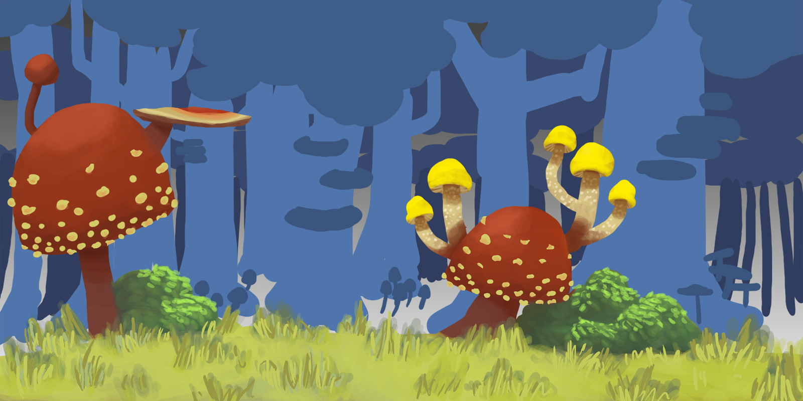
These were all concept environments for the fighting game. Some relate to the character concepts I have, some relate to some of the mechanic concepts in theme, and some are just random shots in the dark.
These are more of the 'fleshed out' ideas that I had. I think I spent more time than I should have on just these few characters. Some of them wouldn't be able to work in the fighting game mechanically. For example, the moth spirits. I came up with them because their wings would be good for customization to hint at what each player had chosen for their abilities in the first part of the game. However, them having wings would mean they'd need to be able to fly using them which would change our fighting mechanic considerably. The oddities at the bottom... well, they were based on a few references I had from cubist painters and Salvador Dali's pictures. They were created from the prompt of my teacher to 'push it more, make it weirder, don't stick to tropes'. I'm not sure if I suceeded in that sense, but I do plan on making more 'weird creatures' to see what everyone thinks.
 |
| example of an in-game fight using our dark-light death mechanic |
The mole game is progressing along slowly. It feels like there is a big dichotomy between the games art direction-wise. The fighter is so nebulous and vast as to what the art direction can be, while the mole game is more slow paced and seems to know what it is.
I'm definitely going to work on shaking that up this week and pulling some more weird concepts out of the hat for this one.
That's it for this week. Stay tuned for Week 4!


No comments:
Post a Comment