Wednesday, April 9, 2014

Final Stretch

The last two weeks have been jam packed with excitement, stress, and production work.


Teeny flipbook


All of the characters are finished, with rigs and finalized textures now. And I even did my first bit of vfx work with a particle system for the enemy bot. It's simple, but I'm proud of my first step in that direction. 


I think what I learned most from this project was about animation and rigging. I've never needed to make rigs for things like this, so it was good for 1. helping me brush up on the things I do know and 2. push me to learn more about rigging. It was useful in that last sense because once I knew what I wanted the character to do, it was easier to try to translate that into 'how can I make the rig do that' or 'how can I arrange the rig so it's easy to use and not too muddled'. There are a few extra features I would have liked to add onto a few of the rigs. Squash and stretch was something I looked into, but wasn't able to really get the rig to work for it in a way that fit the characters. I want to try making a squash and stretch rig for that at some point.

Senior Show is next week on the 17th! I'm nervous, but excited. Everything's coming together for the end of senior year. Now there's just those papers to catch up on... I should probably go do that.

Thanks for watching! I'll probably end up continuing to use this blog to catalog  progress on my next art pieces or other game projects. We'll see.


Sunday, March 9, 2014

Playerbot Rigging blues

Hello!

Here's a bit of an update.

After a lot of thinking, planning, and experimenting, I think I have the basic idea of what player-bot's rig is gonna look like. Making custom rigs is totally new to me and I spent a lot of time looking up tutorials. It's been interesting expanding upon the bit I knew previous about rigs and its starting to make a lot more sense now.


The main objects that are gonna be animated are his arms, wheel, visor, and himself (get the body to balance on the wheel/the wheel to be able to move forward a bit independent of the body).
I'm gonna see if I can schedule a meeting with our animation teacher here to get some advice/help with the rig.


Enemy bot's finished model with color

Made some new concepts for helperbot as well! Last time we looked over playerbot as a team we weren't really sure what to do with him so we let him be to work on the player and enemy bot. 


Having those two done already makes it a little easier to see what kind of designs will fit in and make the trio more cohesive together. Helperbot needs to have a more horizontal silhouette because he blocks the player from escaping and acts kind of like a net/barrier. The player is more vertical and is sort of 'standing up', making it vaguely humanoid. And the design of the enemy bot has a lot of small sharp edges with its tiny knife-like feet. It also kind of looks like a seedy little bug. 

Im personally fond of design D. The idea of it idling spinning it's solar panels while it floats makes me smile. 

See you all later this week with more rig updates and a final design for helperbot. 

Saturday, February 22, 2014

Got the texture onto our little playerbot friend. I brought the sunbot into unity and got the texture working on him after a few snags.


Theres a bit of a strange issue when I brought the texture out to a .tga. It made the colors look a little funny and over-exaggerated the watercolor effect I was aiming for. But I think this is a good start for the texture.


We want to try to create the textures for the whole game using actual watercolors, but we'll see how that pans out after this week's testing of it. Next up to consider is how Im going to be setting up the playerbot's rig. I've animated in 3d before, but not in maya, and not really with something that didn't use a bipedal rig. I've been scoping out possible ways to do this, but I think Im going to reach out to some people for help on it since I'm new at the subject.
Let's hope it goes well! See you next week

Friday, February 14, 2014

Character Progress

Hello,

This week I finished off the first pass of low-poly model for the player-bot. It's not texture yet, just put some quick material color on it in Maya to test out a base of how the colors would work together in 3D.


Here's an image of what the model looks like in game, to get a feeling for how much can be seen. Because we're thinking of having the closeness of the camera vary from level to level (depending on how much the player needs to see of the level at once), I feel like this much detail in the model is good.


The enemy character model is on it's way, still trying to figure out how to match the thickness of the model with the thickness of the legs. Need to push the legs a little more so they look more sturdy. The enemy needs the legs to be able to land sturdily on the planets and to collect energy.


Part of this week's work is research into setting up a rig for the main character for animation, which should be interesting; it'll be a learning experience for sure since I've only ever made rigs for bipedal humans and never 'vehicle-like' things.

Friday, February 7, 2014

Main Character


This week, I worked on creating the low poly for the main character in maya. The focus was mostly on making sure the polycount was relatively low (aiming for less than 1500 tris), and making sure everything fit together nicely and worked outside of the concept art.


Some of the comments we got on the art in our project was to make sure our characters had good potential for animation. Because the screen of the game is relatively small on tablet, we won't see the character very up close and their actions are going to help sell the game even better. This weekend Im going to put together a test character for our programmer so she can see if the animation for controller the shooting direction can be done through programming rather than on the art end.  

Friday, January 24, 2014

Narrowing Down Art Choices

After having our class yesterday and doing a review, we've come down to a few design choices for the characters.


Our foremost concern for all of the characters that will be in space is their silhouette. As I mentioned in last week's post, their shape is going to be very important in that it'll allow the players to recognize the characters from afar more easily. This idea is a bit more important concerning the difference between the player character and the enemy characters. 
For this reason we've chosen to go with radical shape differences between the two. As you can see with the Anti-Bot, we want to go for a shape that's much different than the almost humanoid preferences circled in the player-bot section. I want the player-bot to have a lot more softness to it and I kind of like the contrast the anti-bot has at the moment with it's harsh, almost industrial appearance.


Helper-bots silhouette was sort of known from the start. Everyone seems to like it's longer shape which helps in it's function; its meant to keep the players from straying out of the 'playing field' and follows the player around to stop it from doing so. Kind of like a space goalie with the player being the ball. The ones with the red checks next to them seemed to be the more popular during the review in class. I'm particularly fond of the bottom left one and the middle one. 
I've been taking animation into consideration for these, too. Especially for the main character. That was one of the critiques we received for the main character. Now that I'm on as the team's animator, it's going to be an interesting task to make these robots move. The somewhat humanoid one in the top middle of the picture below seems to have the best potential for interesting animations. 


See you next week!


Friday, January 17, 2014

Update 2

Hello everyone!

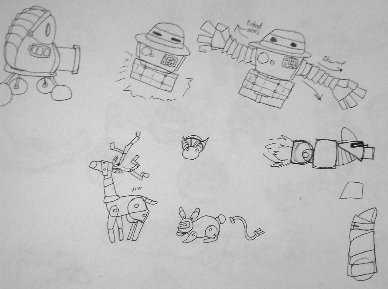
Pretty straightforward this week, just some concept art to upload.


Most of this is just start up to get ready for Greenlight. Our team is planning on doing our greenlight presentation in 2-3 weeks. I'm going to be working on some more character concepts to show the team on Sunday so we can start honing on styles and shapes for the characters. I tried to branch out in the robot's designs. Though there's only one example of it, the reason I didn't want to go into the style of the Mars rover-type robot is that it seems too realistic for this game. But when I showed the concepts to our lead artist, she seemed to like something about it, so that might be something the team brings up as interesting. Otherwise, I tried to push the designs in simple styles, complicated styles, round vs. hard edges, and a few humanoid robots.

We had a discussion about wanting to try out a new mechanic in order to make the zoom in feature more useful. The idea that there might be life on the planets if you zoom in was given, so I started doing some ideas of things that could live on the planets. Robotic animals, anyone? Logically, it might not make too much sense but this game is pretty whimsical so the team might like the idea. 

Till next week!